
REFERENCES


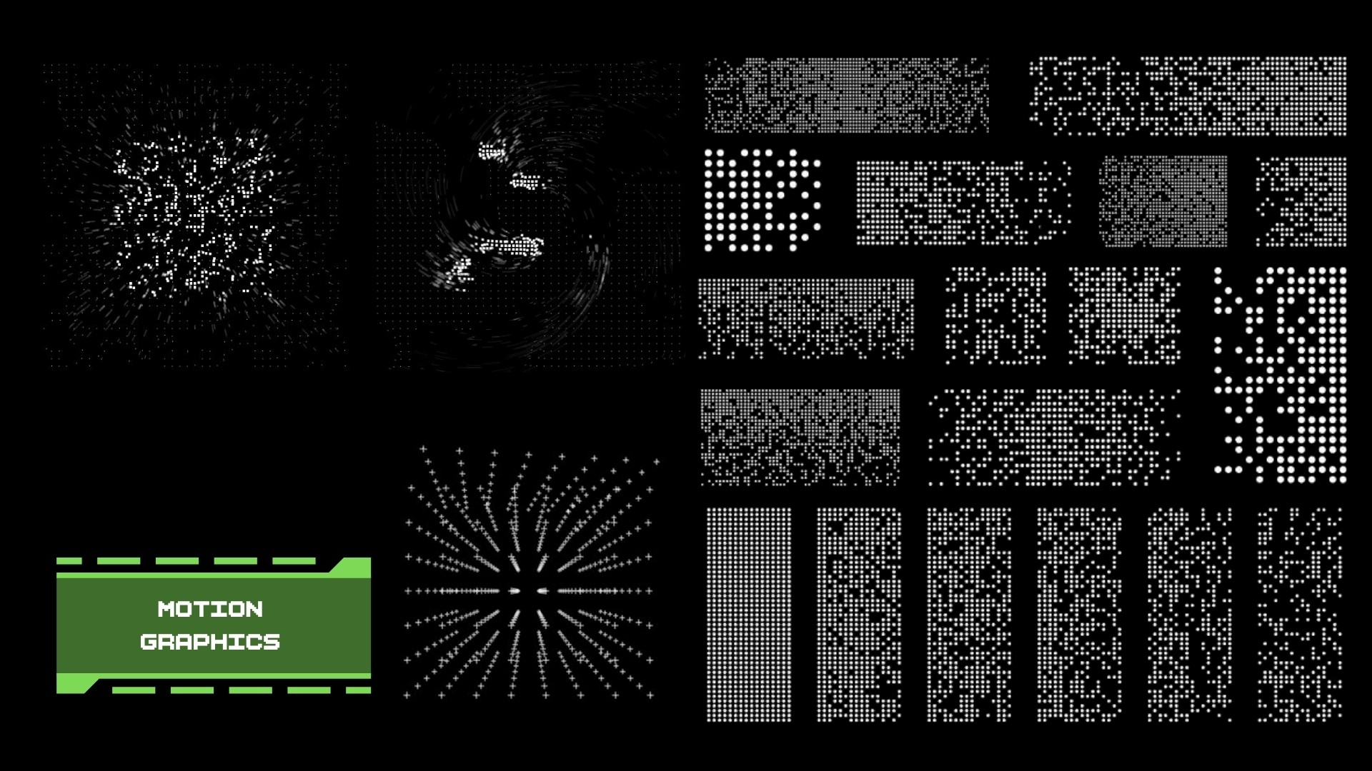
MOTION DESIGN REFERENCE


FINAL DESIGNS


The initial concept used red to represent high stress, with increasingly chaotic pixels reflecting the user’s physiological state. The feedback highlighted that red itself can feel alarming and may intensify stress rather than help the user manage it. This prompted us to rethink the stress-state colour system and explore a calmer, less triggering visual response while still clearly communicating elevated stress.