01
01
01
Holigrain
Holigrain
Making ancient grains feel anything but ancient.
A bold identity and packaging system for Surati’s new range of oven-baked snacks—developed across nine products for the Canadian and U.S. markets.
Making ancient grains feel anything but ancient.
A bold identity and packaging system for Surati’s new range of oven-baked snacks—developed across nine products for the Canadian and U.S. markets.
Making ancient grains feel anything but ancient.
A bold identity and packaging system for Surati’s new range of oven-baked snacks—developed across nine products for the Canadian and U.S. markets.
role →
role →
Brand Identity, Packaging Design & Campaign
Brand Identity, Packaging Design & Campaign
year →
year →
2025
2025

Better-for-you shouldn’t have to look boring.
Holigrain was created to bring ancient grains such as sorghum, ragi, quinoa, amaranth and chickpeas into contemporary everyday snacking.
The opportunity was to create a better-for-you snack brand with the appetite appeal and shelf impact of a mainstream snack—without falling into the muted, overly clinical visual language commonly associated with health foods.
Better-for-you shouldn’t have to look boring.
Holigrain was created to bring ancient grains such as sorghum, ragi, quinoa, amaranth and chickpeas into contemporary everyday snacking.
The opportunity was to create a better-for-you snack brand with the appetite appeal and shelf impact of a mainstream snack—without falling into the muted, overly clinical visual language commonly associated with health foods.
LOGO DEVELOPMENT
LOGO DEVELOPMENT
LOGO DEVELOPMENT
The Holigrain identity needed to communicate natural ingredients and better-for-you credibility without feeling rustic, traditional or overly serious. The goal was to create a wordmark with enough warmth and character to feel approachable, while remaining bold enough to lead a contemporary snack brand.
The Holigrain identity needed to communicate natural ingredients and better-for-you credibility without feeling rustic, traditional or overly serious. The goal was to create a wordmark with enough warmth and character to feel approachable, while remaining bold enough to lead a contemporary snack brand.
The Holigrain identity needed to communicate natural ingredients and better-for-you credibility without feeling rustic, traditional or overly serious. The goal was to create a wordmark with enough warmth and character to feel approachable, while remaining bold enough to lead a contemporary snack brand.

MY ROLE
MY ROLE
MY ROLE
From positioning to production.
I worked across the development of Holigrain from brand strategy and logo creation through packaging, production artwork and launch communications.
My role included brand positioning, logo development, visual identity, packaging architecture, SKU differentiation, Canadian and U.S. packaging adaptations, bilingual artwork, production-ready files and campaign design.
From positioning to production.
I worked across the development of Holigrain from brand strategy and logo creation through packaging, production artwork and launch communications.
My role included brand positioning, logo development, visual identity, packaging architecture, SKU differentiation, Canadian and U.S. packaging adaptations, bilingual artwork, production-ready files and campaign design.
THE CHALLENGE
THE CHALLENGE
THE CHALLENGE
Healthy enough to trust. Bold enough to crave.
How might we make an ancient-grain snack feel as craveable and shelf-impactful as a mainstream chip brand—without losing the trust and clarity consumers expect from better-for-you food?
The brand needed to communicate nutrition and product benefits quickly while still feeling energetic, flavourful and exciting enough to compete in the conventional snack aisle.
Healthy enough to trust. Bold enough to crave.
How might we make an ancient-grain snack feel as craveable and shelf-impactful as a mainstream chip brand—without losing the trust and clarity consumers expect from better-for-you food?
The brand needed to communicate nutrition and product benefits quickly while still feeling energetic, flavourful and exciting enough to compete in the conventional snack aisle.
Healthy enough to trust. Bold enough to crave.
How might we make an ancient-grain snack feel as craveable and shelf-impactful as a mainstream chip brand—without losing the trust and clarity consumers expect from better-for-you food?
The brand needed to communicate nutrition and product benefits quickly while still feeling energetic, flavourful and exciting enough to compete in the conventional snack aisle.


DESIGN DIRECTION
DESIGN DIRECTION
DESIGN DIRECTION
Healthy enough to trust. Bold enough to crave.
How might we make an ancient-grain snack feel as craveable and shelf-impactful as a mainstream chip brand—without losing the trust and clarity consumers expect from better-for-you food?
The brand needed to communicate nutrition and product benefits quickly while still feeling energetic, flavourful and exciting enough to compete in the conventional snack aisle.
Healthy enough to trust. Bold enough to crave.
How might we make an ancient-grain snack feel as craveable and shelf-impactful as a mainstream chip brand—without losing the trust and clarity consumers expect from better-for-you food?
The brand needed to communicate nutrition and product benefits quickly while still feeling energetic, flavourful and exciting enough to compete in the conventional snack aisle.
Healthy enough to trust. Bold enough to crave.
How might we make an ancient-grain snack feel as craveable and shelf-impactful as a mainstream chip brand—without losing the trust and clarity consumers expect from better-for-you food?
The brand needed to communicate nutrition and product benefits quickly while still feeling energetic, flavourful and exciting enough to compete in the conventional snack aisle.



CANADA & USA PACKAGING
CANADA & USA PACKAGING
One Brand. two marets
One Brand. two marets
One Brand. two marets
Holigrain required separate market-ready packaging systems for Canada and the United States.
The core visual identity remained consistent while copy, nutritional content and regulatory information were adapted to the requirements of each market.
Holigrain required separate market-ready packaging systems for Canada and the United States.
The core visual identity remained consistent while copy, nutritional content and regulatory information were adapted to the requirements of each market.
canadian packaging
canadian packaging
canadian packaging
Canadian packaging incorporated bilingual English and French communication across product names, flavours, descriptors and required information.
The challenge was to accommodate significantly more copy without compromising front-of-pack hierarchy or the visual impact of the design.
Canadian packaging incorporated bilingual English and French communication across product names, flavours, descriptors and required information.
The challenge was to accommodate significantly more copy without compromising front-of-pack hierarchy or the visual impact of the design.
usa packaging
usa packaging
usa packaging
U.S. artwork used the same core packaging system while adapting market-specific product copy, nutritional information and regulatory content.
This ensured the brand remained immediately recognizable across both markets.
U.S. artwork used the same core packaging system while adapting market-specific product copy, nutritional information and regulatory content.
This ensured the brand remained immediately recognizable across both markets.


social media
social media
social media
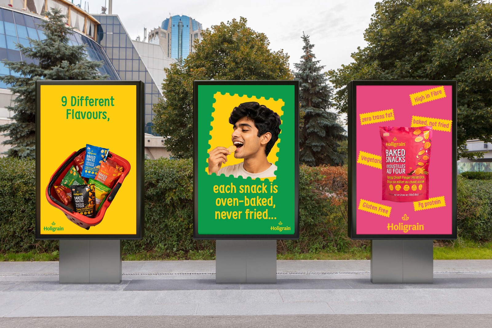
Turning product benefits into quick visual stories.
Social content was designed to balance product awareness, flavour communication and nutritional messaging.
Rather than treating each post as an isolated composition, the social system extended the same typography, colour and graphic language used across the packaging.
This helped create a consistent brand experience from the shelf to the screen.
Turning product benefits into quick visual stories.
Social content was designed to balance product awareness, flavour communication and nutritional messaging.
Rather than treating each post as an isolated composition, the social system extended the same typography, colour and graphic language used across the packaging.
This helped create a consistent brand experience from the shelf to the screen.
Turning product benefits into quick visual stories.
Social content was designed to balance product awareness, flavour communication and nutritional messaging.
Rather than treating each post as an isolated composition, the social system extended the same typography, colour and graphic language used across the packaging.
This helped create a consistent brand experience from the shelf to the screen.